Thursday, October 27, 2011

House Tour - Outside

Taking a break from the inside of the house, we turn our attention to the exterior....


Here's the front of the house; not much in the way of landscaping but hopefully in spring we can add a few things to spruce up the yard. The front screen door is the original aluminum door...and even though we appreciate the retro-ness of it, it's going to get replaced...soon (the handle snapped off when I tried opening the door the other night!).
The window at the peak of the house is for the attic. I haven't made my way up there yet, but Jeremy has and from what he could tell it's clean, empty and has a floor! For the time being we'll use it as extra storage but eventually we'd love to open it up and add a second floor to the house.


Looking down the side of the house. In spring we're going to be installing a fence that will run down the lot line to the front of the house.


The very nice sized back yard and the garage. The garage needs a fresh coat of paint and a few repairs, but otherwise it's in great shape. It's also stocked with tools and gardening equipment (thank you Grandpa!). The red fence will get replaced next year when we fence in the rest of the yard.
Growing along the back of the garage is a pink rose bush, a peony bush and a clematis, which are all staying put. The penoy bush was transplanted to the yard many, many years ago; it was origianlly planted by Jeremy's great-great-grandparents in their yard! The grassy area to the right of the garage is going to get turned into to a vegtable garden next year; it gets plenty of sun and there's enough space for four raised beds.


Another view of the garage and house. The lawn in the foreground of the picture is where the raised garden beds will go.

The view looking from the fence to the front of the house. The window in the back of the house is for the master bedroom; next spring the house is going to get new windows and we're contemplating replacing that window with a set of French doors that would open up to a patio or deck. Of course that would mean building a patio or deck...


Another view of the yard and the neightbors house, they're our house twin! (Actually there's 4 houses in a row with the same floor plan, but the yellow one most closely resembles ours from the outside.)


And here is the most important thing about the yard....the dogs LOVE IT! Seriously, they are madly in love with this yard. There's room to run around, lots to sniff, and as you can see the grass is perfect for rolling in!


Next up...we head back inside for a look at the basement ManCave.

Wednesday, October 26, 2011

House Tour - The Main Floor

Before we get into the nitty-gritty of home renovations, let's start off with some "before" pictures.

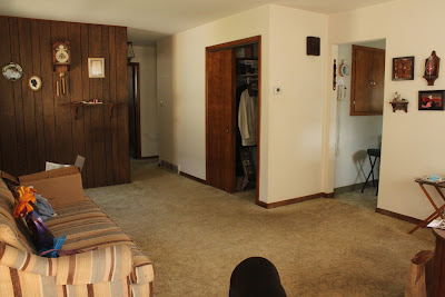
Coming in the front door this is the view of the living room. The doorway on the right leads you into the kitchen. The hallway on the left leads to the bathrom, bedrooms and dining room. And the black blob in the bottom center of the picture? That's Johnny's behind, he tends to get in the way a lot...get used to it.

This is the view from the hallway looking towards the front door. The large front window is actually a bay window and there's one more window to the right, just out of the picture. And let's take a moment to admire
the wood panneling on wall to the right...so chic, so 70's, so about to be torn down.

Close up of the living room closet. Like most older houses, this house as a few structural quirks...this closet is one of them. We figured out that it's not original to the house, it was added sometime in the 70's (about the same time the panneling when up I think). The strange thing about it is that's its really a closet within a closet....confused? So were we. There the big "normal" closet and then behind that is a deep (and dark) cubby hole with shelves. It's great for extra storage, but pretty inaccessable, hopefully we can find a way to make it a little more functional.
 Another view of the living room, this time from the corner where the other window is.
 View from the kitchen out into the living room. I think Lola was trying to escape...
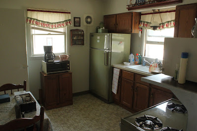
 Moving on from the woody goodness of the living room we go into the kitchen. This picture is looking into the kitchen from the living room door way. It's hard to tell in this picture but there's a second door in the kitchen that leads to the basement stairs and the dining room. The kitchen as a whole is a good size, but a little light on cabinet space and counter tops.
 And there's avacado green appliances....

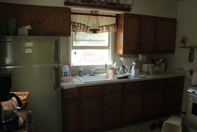
 Looking into the kitchen from the other door.
 Structural quirk #2....another deep, dark cabinet that is just kindof "floating" in the wall opposite the sink and cabinets. Not really sure what do do with it yet...


As you walk out of the kitchen door you're met with the back door to the house, a door to the dining room and the basement stairs. Forgive me for not getting pictures of the dining room entrance, but here are the basement stairs...exciting, right?
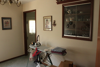
The picture below is of the dining room while standing in the hall/doorway off the kitchen, right by the stairs. The dining room used to be a 3rd bedroom, but during the house remodel a second doorway was added (the one I'm standing in to take the picture) and the room was converted into a dining room. The other door you see in the picture leads out into the hall and the two bedrooms ( you can see a sliver of the guest bedroom). Behind that open door is a closet (a remnant from when the room was a bedroom)
The dining room from the other doorway. The china cabinet in the wall was another additon during the rennovations...I have big plans for it!
 I call this the "dining nook" and it's where our dining room table will eventually live...assuming we get one. For reference, I'm standing over by the built in cabinet.
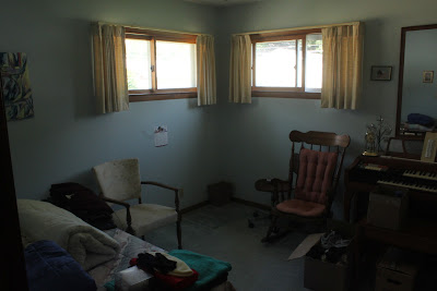
 Here's the master bedroom. The door for this room is directly across the hall from the door into the dining room. There are only those two small windows in the room, so not much in the way of natural light.
 Master bedroom again.
 And again.
Moving down the hall from the master bed room you come to the spare room, which for us will be an office/guest bedroom (sorry for the entierly too dark picture).
 The spare room again, looking out into the hall. If you were to walk out of this room you could either go straight into the living room, turn right into the bathroom or turn left and head back to the master bedroom and dining room.
One more.
 And finally we come to the bathroom...the itty bitty bathroom. Jeremy and I joke that everytime we move we end up with a smaller and smaller bathroom; we started huge and keep downsizing. Maybe someday we can expand this one.

Blue sink and toilet...someday to be replaced with white.


 So that's the main floor of the house. One thing that's hard to tell from all these pictures is that the house is laid out in a circle, with a "column" in the center; the column being the basement stairs and the various closets and built-ins. Yeah, I was confused at first too...don't worry, I'll post a floor plan. Next up...a little field trip outside!

Wednesday, October 12, 2011

The Inherited Home

Welcome to The Inherited Home!

Like so, so, so many blogs out there we're here to chronicle the transformation of our first home.

What is it about a first home that compels so many people to start home transformation blogs? Does everyone secretly desire to be as awesome (and profitable) as The Centsational Girl (who is seriously centsational) or Young House Love (could they be more lovable)?

Perhaps. But lets be honest, in a virtual world where home improvement blogs are as abundant as hilarious cat memes...

the chance of actually striking it rich are slim to none. So why are we here? Becuase you only get one first house, and this is ours. We want to be able to look back on this journey in 15 or 20 years and smile about the good times, laugh about our mistakes (of which there will be many) and if we're (really) lucky share this crazy adventure with our kids.